Risograph Effect
Risograph effect for images and video: one to six spot inks, each on its own dot screen and a little off register. Pick an ink pair, then export a still or GIF.
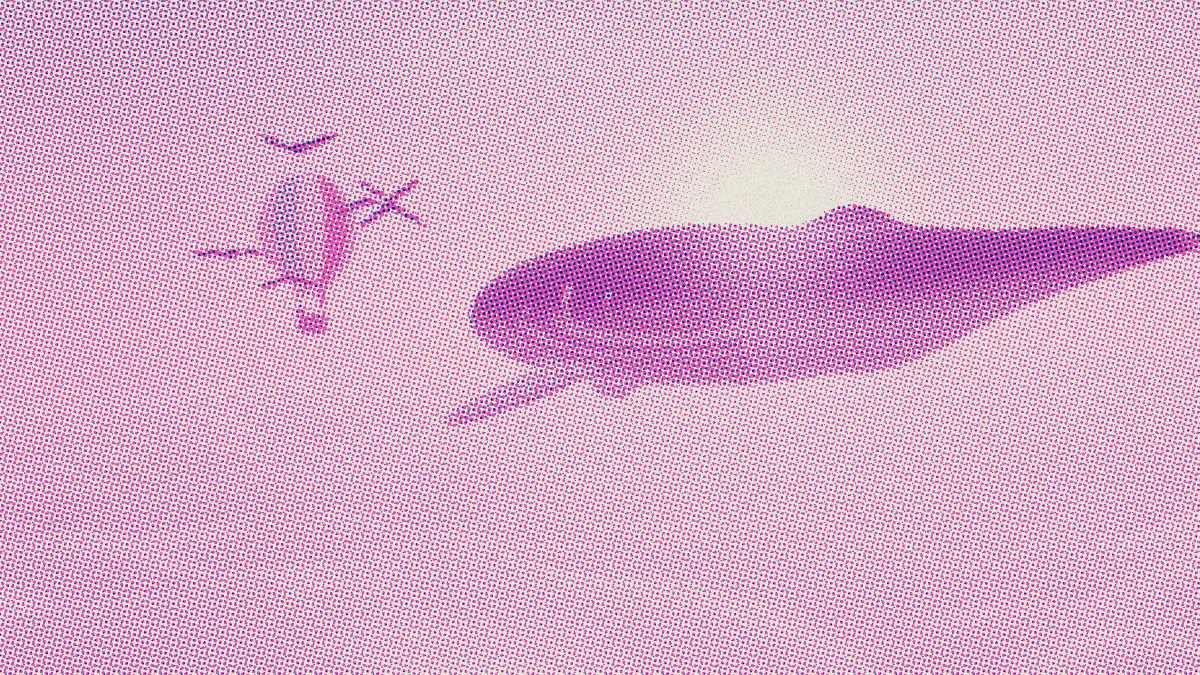
What is a risograph?
A Risograph is a digital duplicator made by the Riso Kagaku Corporation and introduced in Japan in 1980. It makes a stencil master of the original, wraps it around an ink drum, and prints one spot color per drum in soy-based ink on uncoated paper.
Artists picked it up in the 2010s for zines and comics. A riso print has bright spot colors, a visible screen and paper grain, and its layers never quite line up, since each color comes from its own drum.
How to make a riso print effect
Load an image or video and choose Inks: anywhere from one to six colors, with ready sets like Pink + blue, Teal + orange, Black + yellow and Blue, pink, yellow. Size sets the screen, and Shape picks Dot, Line, Cross or Diamond for every drum.
Under Press, Misregistration sets how far each drum drifts, Ink spread makes the colors print heavier, and Paper and Paper grain set the stock. Seed picks a different drift and grain, and the same seed gives you exactly the same ones back.
The Three drums, Tight register and Line screens presets cover the common variations. If you want opaque inks that hide each other instead of mixing, Screen Print Effect is the other print look here.
How does the risograph effect split the colors?
For each cell of the screen, it works out which amounts of each ink, layered over your Paper color, get closest to the original. It solves this in terms of how much light each ink absorbs, so the inks act like translucent riso ink and pink over blue makes purple.
Each drum gets its own screen angle, 15°, 75°, 0°, 45°, 30° and 60° in ink order, plus its own drift. So the dot screens cross instead of stacking, and even a two-ink print covers colors neither ink has by itself.
Settings for a two-ink zine cover, a three-drum poster and a tight art print
Two-ink zine cover: go with Teal + orange for a photo of people outdoors, since those inks mix into a warm skin tone and a cool sky. Pink + blue suits night scenes and neon. The sets use the published screen values of real Riso inks, like Fluorescent Pink #ff48b0, Blue #0078bf, Teal #00838a and Orange #ff6c2f.
Three-drum poster: the Three drums preset loads Blue, pink, yellow with Misregistration at 3. Those three behave like a rough cyan, magenta and yellow, so the separation reaches most hues, and the wider drift makes the layering obvious.
Tight art print: the Tight register preset drops Misregistration to 0.3 and Paper grain to 0.05. The inks still overlap the way riso does, and the shapes line up.
Why did the greens in my photo turn blue?
The effect can only print colors its inks make when they're layered on the paper. With Pink + blue there's no ink a green can come from, so it prints as a dusty blue, and a yellow turns pink.
Choose inks whose mixes hold the colors that matter in your picture, or add a third drum: Blue, pink, yellow covers greens and yellows. With Teal + orange, greens come out an olive gray and reds come out orange.
Saving a riso print
What you get is one color picture, without separations. A riso studio needs a grayscale file per drum, so use the effect to settle the look and the ink pair, then separate the artwork for the studio.
Paper grain speckles every pixel, and that costs file size. For a GIF, lower it to 0.05 or less. For a still, PNG keeps the grain and the screens exactly.