Long Shadow Generator
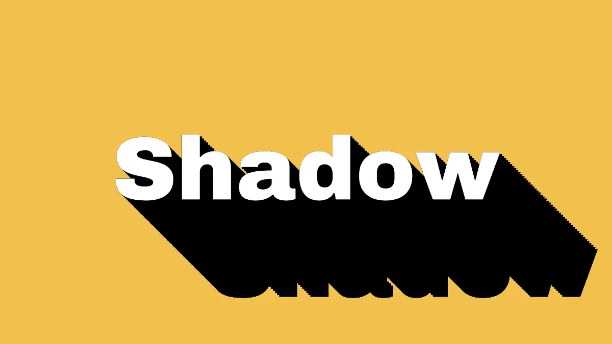
Long shadow generator for the flat design look: a word casts a hard, flat shadow that runs out at 45 degrees. Change its angle, length and colors for free.
What is a long shadow?
A long shadow is a flat, hard-edged shadow running off a letter or icon at a steady angle, usually 45 degrees. It's much longer than a normal shadow and often reaches the edge of the frame. It comes from flat design, the plain-shapes-and-solid-color style Android and iOS switched to in the early 2010s.
A classic drop shadow is soft and offset, to make an object look raised off the page. A long shadow has no blur and no gap. It starts right at the edge of the shape and keeps going.
How to make a long shadow
The tool opens with the word Shadow in heavy white type on mustard yellow. Put your own word in Text and choose a Font and Weight.
Under Extrude, Direction is the angle in degrees, with 0 pointing right and 90 pointing down. It starts at 45, so down and to the right. Depth is the length, and it's already at its longest. Side is the shadow's color.
Shade darkens the shadow toward the far end. The tool opens on a black Side, which has nowhere darker to go, so you'll only see Shade once Side is a lighter color.
Settings for a classic flat icon, a two-tone poster and a shadow to the left
Classic flat look: make Side a deeper tone of the Backdrop in place of black, say #c99a2e on the mustard #f2c14e. Flat icons usually drew the long shadow as see-through black over the background, which ended up as a darker shade of that background. Picking the shade yourself gets you the same result.
Two-tone poster: Colour #ffffff, Side #d1495b, Backdrop #edae49, Shade 0.4. A colored shadow that darkens toward its end suggests depth and still keeps things flat.
Shadow to the left: Direction 135 points it down and to the left, and 225 up and to the left. Use those when the light source is on the other side of the layout.
Why does a long shadow look stepped on thin letters?
The shadow is 48 copies of the word, each a 48th of Depth further out. At the full Depth of 0.4 a single step is about 9 pixels on a 1080p frame. A stroke thinner than that leaves gaps, and the shadow's edge turns into a row of ridges.
Keep Weight at 900, make Size bigger, or shorten Depth until the steps close up. At the opening size of 0.26, heavy type has strokes several times wider than one step, and that's why it looks smooth.
Can you add a long shadow to a logo or icon?
Yes. Load a PNG with a transparent background, empty the Text field so no word gets drawn, and set Shape from to What is see-through. The shadow then follows the picture's outline.
On the default, What is dark, the black canvas counts as empty and light lettering counts as the shape, so keep your letters a light color. If you'd like deeper, solid letters in place of a flat shadow, 3D Block Text Generator opens on a short Depth with a shaded side.
Saving a long shadow
It's all flat color, so PNG keeps the file small and the diagonal edges clean. JPG puts blocky noise along those long 45-degree edges, right where it's most visible. To run the shadow across your own layout, tick No backdrop and save PNG or WebP.