Pop Art
Pop art is the 1950s and 60s movement built on ads, comics and celebrity. How it began in London, why it looks printed, and who belongs besides Warhol.
What is pop art?
Pop art is an art movement of the late 1950s and 1960s that took its imagery from mass culture: advertising, comic strips, packaging, movie stars and supermarket goods. Its best-known works, like Andy Warhol's soup cans and Roy Lichtenstein's comic panels, borrow the flat colors and hard edges of commercial printing.
Its artists treated the pictures everyone saw every day as worth painting, usually with a straight face that left viewers unsure whether they were looking at praise or satire.
Where did pop art start?
It began in London, a few years before New York took it up. The Independent Group, a circle of artists, architects and critics who met at the Institute of Contemporary Arts in the early 1950s, studied American magazines, science fiction and adverts with real seriousness. Eduardo Paolozzi's 1947 collage I was a Rich Man's Plaything, now at Tate, already has a toy gun firing the word Pop.
The critic Lawrence Alloway is usually credited with putting the term into print. In 1957 Richard Hamilton wrote to the architects Peter and Alison Smithson with a list of what pop art should be, which starts with popular, transient and expendable and ends on glamorous and big business.
Why does pop art look printed?
Many of its artists came from commercial art. Warhol had a busy career drawing shoe advertisements in New York in the 1950s, and photographic silkscreen appealed to him because it repeated an image the way a press does.
His 32 Campbell's Soup Cans, first shown at the Ferus Gallery in Los Angeles in 1962, were painted by hand, yet each canvas copies the label with the flat, even color of a printed can. In his screen prints, the smudges, gaps and slipped layers that a commercial printer would throw away became part of the work.
Is pop art just Warhol and Lichtenstein?
Those two are the names everyone knows, and the movement was much wider. In Britain it included Hamilton and Peter Blake, who designed the cover of the Beatles' Sgt. Pepper's Lonely Hearts Club Band with Jann Haworth in 1967. In the United States, Claes Oldenburg sewed giant soft hamburgers and light switches, James Rosenquist brought his skills as a billboard painter to huge canvases, and Marisol and Rosalyn Drexler were part of the scene from early on. In West Germany, Sigmar Polke and Gerhard Richter answered with what they called Capitalist Realism.
A quick test for pop art is the source. If the image looks lifted from a magazine, a can or a comic and blown up without apology, it probably belongs.
Making a pop art picture
Pop Art Effect cuts a photo into four flat inks by brightness. For a Warhol-style grid, save the same portrait four times with different sets under Inks (the default, Riso, Forest and Print inks, say) and tile the four saves in any layout program. A face lit from one side with a plain background gives the cleanest result. For Lichtenstein's dots on top, open one of the saves in Comic Book Filter.
Try it
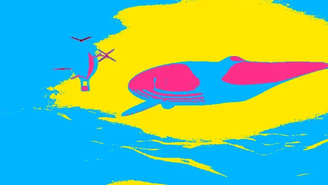
Pop Art Effect
Pop art effect: turn pictures into flat black, hot pink, cyan and yellow inks, like a Warhol screen print. Pick your own inks, then save a PNG or MP4 for free.
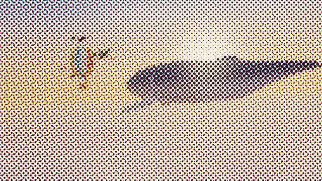
Comic Book Filter
Comic book filter for photos and video: big cyan, magenta, yellow and black dots with pure black shadows, like a blown-up vintage comic panel. Exports GIF too.