Op Art
Op art is 1960s abstract painting made of stripes, checks and circles that seem to pulse or bulge. Where the name came from, and why your eyes see motion there.
What is op art?
Op art, short for optical art, is abstract art built from precise geometric patterns that make a still surface seem to flicker, swell or move. The motion happens in your visual system, since nothing on the canvas changes.
A typical op art piece uses black and white or a few flat colors, with lines, squares or dots that shrink, bend or shift in small steps across the picture. Look at it for a few seconds and the flat surface starts to ripple, tilt or glow at the edges.
Who named it, and when did it peak?
The name came from the press before the artists used it. An unsigned article in Time magazine in October 1964 called the style op art, as a pun on pop art, and it stuck within months. Several of the painters disliked the label.
The peak came a few months later. The Museum of Modern Art in New York opened The Responsive Eye on February 23, 1965, a show of optical and perceptual painting curated by William C. Seitz. Victor Vasarely, who had been painting zebras out of black and white stripes since the 1930s, was in it. So was Bridget Riley, whose Movement in Squares of 1961 squeezes a grid of checks until it seems to fold away from you.
Fashion moved faster than the museum. Before the show even opened, a manufacturer had bought paintings to turn into dress fabric, and Riley found copies of her patterns in Madison Avenue shop windows. Op art patterns soon turned up on dresses, ads and shopping bags as well.
Why do the patterns seem to move?
Your eyes are never perfectly still. Even when you stare at one spot they make tiny involuntary jumps, and each jump slides a fine, high-contrast pattern across the light receptors. With most pictures the brain cancels that out. With dense parallel lines, every small shift changes the signal everywhere at once, and the brain reads the change as motion.
Afterimages add to it. Black and white bands tire the receptors that see them, so a faint negative copy of the pattern lingers and overlaps the real one. Where the two don't line up you get the shimmering, slightly colored fringes that make Riley's black and white canvases look tinted. Vision scientists still argue about how much each effect contributes, and the artists worked out what worked by trial, years before the research caught up.
How to spot op art and its descendants
Look for a pattern with no subject, a strict rule behind it and a gradual change across the surface: lines that get thinner toward the middle, checks that bulge, circles that drift off center.
The style never fully left design. You see it in album covers, in hypnotic animated GIFs, in sports kits and in shop floor tiles. Two fine grids laid over each other at a slight angle give a moiré, which is the same trick done by accident.
Making an op art pattern
Open the Stripe Pattern Generator and set Foreground to black (#000000) and Background to white (#ffffff). Thickness 1 makes the dark and light bands equally wide. A Size between 12 and 24 gives lines fine enough to buzz on a phone screen, and Pattern set to Rings or Waves bends them, which is where the movement starts. Scroll at 0.2 lets them creep for an MP4 or GIF.
For a Vasarely-style chessboard, the Checkerboard Pattern Generator with Angle 45 turns the squares into diamonds. Saving that as a still and running it through the Kaleidoscope Maker at 8 or 12 sides folds it into a radial pattern that pulls toward the center.
Try it
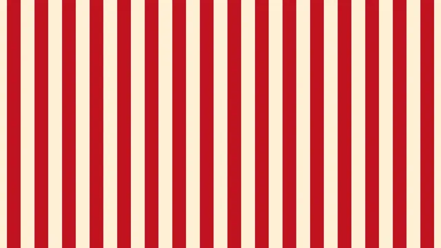
Stripe Pattern Generator
Stripe pattern generator: straight or diagonal stripes in two colors, from thin pinstripes to wide awning bands. Save a PNG, or let them scroll as MP4 or GIF.
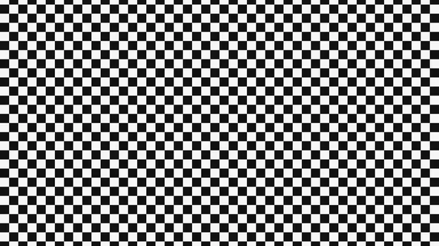
Checkerboard Pattern Generator
Checkerboard pattern generator: two-color checks at any square size and angle, from a chessboard to diagonal harlequin diamonds. Save as PNG, MP4 or GIF.
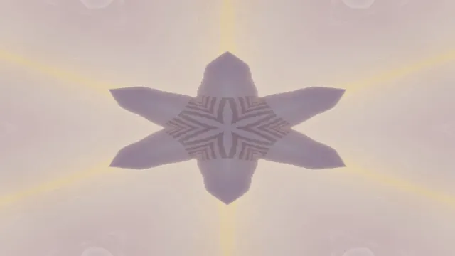
Kaleidoscope Maker
Make a symmetrical photo or video with a kaleidoscope effect: 2 to 12 mirrored wedges arranged around the center. Free, runs in your browser, saves MP4 or GIF.