Sepia Filter
Sepia filter for photos and video: the warm brown sepia tone of an old print, with shadow and highlight colors yours to change. Save a still, MP4 or GIF.
What is sepia tone?
Sepia is the reddish brown of toned black-and-white prints, named after the ink of the cuttlefish genus Sepia. Sepia toning swaps the metallic silver in a print for silver sulfide, which warms the image and helps it last longer.
Kodak's sepia toner works in two baths. First a bleach turns the silver image back into silver bromide until it fades or goes yellow, and then the toner redevelops it in brown.
How does this sepia filter work?
It measures each pixel's brightness and maps it between two colors, a dark brown for the shadows and a pale cream for the highlights. The photo's own colors get replaced, so a modern color picture turns into a sepia photo in the single warm hue of an old print.
The two colors are mixed in a straight line by brightness. The original's tonal range survives, even though its hues are gone.
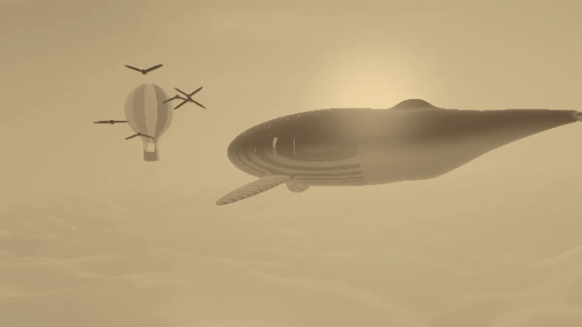
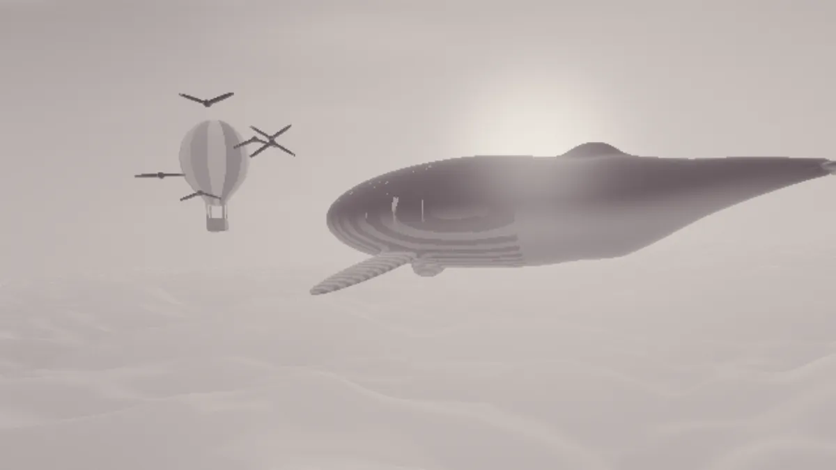
CSS has a sepia() filter, which the W3C defines with fixed weights. It keeps black at pure black and only takes white to #ffffef. On the whale and balloon picture used for this page's example, it pushed the red channel of half the pixels to its maximum and turned the clouds a flat pale yellow, #fde2b0. This filter made them a tan #bda780 and held black and white to the ink and paper colors of an old print.
How to add a sepia effect to a photo
The page opens on the Sepia preset, with a dark brown Shadow, a cream Highlight and full Intensity.
Shadow is the darkest tone and Highlight the brightest. A lighter Shadow gives you a faded, low-contrast print, and a deeper one gives stronger blacks.
Intensity blends the sepia version with the original. Under the hood it's the same engine as Duotone Generator, which has other color pairs ready as presets.
Settings for a cabinet card, a split-toned print, a selenium tone and a darker print
For a cabinet card, use Shadow #2b1a0e and Highlight #e6d2a8. The slightly darker cream reads as aged card stock. For a split tone, try Shadow #222222 with the cream Highlight #f1d9a9, which leaves gray shadows under warm highlights, like a print pulled out of the toner partway.
For a selenium tone, set Shadow #2e1f2a and Highlight #f2ece4. Kodak describes selenium toner giving a purplish brown on neutral papers, so a plum-brown shadow gets closer to it than sepia does. For a darker print, use a deeper Shadow like #1e1209. Kodak's advice was to print slightly darker than normal before sepia toning, because the toner lightens the print.
For three tones, say black shadows, brown midtones and cream highlights, build the stops in Gradient Map.
Why does my sepia photo look orange instead of brown?
Intensity below 1 mixes the photo's own colors back in. Saturated parts, like a red coat or a blue sky, then push the tone toward orange or gray. Keep Intensity at 1 if you want a print in one hue.
A Highlight that's too saturated does the same thing to the bright half of the picture. A pale cream like #f1d9a9 stays believable, but a stronger yellow such as #ffc070 looks orange.
Should I make a photo black and white before adding sepia?
Lots of tutorials start with a black and white conversion, because their sepia is a brown tint laid over the color photo. This filter replaces every color with its brightness first, so at Intensity 1 the conversion changes nothing. We ran the example picture through Sepia with and without a plain gray conversion first (Saturation -1 and nothing else), and the two differed by at most 1 level out of 255. Black and White Converter's own preset adds Contrast 0.1, so a picture that goes through it comes out a bit punchier, and that's the only difference.
Below Intensity 1, the conversion does matter. At Intensity 0.6 the balloon's pink stripe in the example came out a rosy brown, #9d7764, but drained to gray first it stayed a plain grayish brown, #8a7e6c. For a faded sepia with no color peeking through, save a gray version from that converter and open it here.
Printing and sharing a sepia photo
For a print, save a PNG and print it on plain white paper, so the cream Highlight stands in for the toned paper base. For sharing online, a JPG or WebP is a fraction of the size and looks the same at a normal viewing distance.
With a GIF, the Dither box trades size for smoothness. A 960 by 540 sepia frame of the example came to 56,053 bytes without dither and 120,024 with it. Even undithered, the GIF kept every pixel within 4 levels of its color, in 54 shades of brown. Try it unticked first, and tick it if a smooth sky shows steps.