Split Complementary Colors
Split complementary colors pair one hue with the two neighbors of its opposite on the color wheel. The rule keeps a complement's punch with far less tension.
What are split complementary colors?
Split complementary colors are a base hue plus the two hues on either side of its complement. Instead of pairing blue with orange, you pair blue with red-orange and yellow-orange.
On a twelve-hue wheel the two partners sit 150 degrees away from the base, one step short of the opposite point on each side. Joined up, the three hues form a tall, narrow isosceles triangle, which is the easiest way to spot the scheme on a wheel diagram.
Why split a complement at all?
A pure complementary pair is the strongest contrast of hue there is, and that can be tiring. Two opposite colors at equal strength seem to vibrate where they meet, which is the whole trick of a lot of Op art and also the reason a red label on a green panel is unpleasant to read.
Splitting the complement softens that. The two partners are still on the far side of the wheel, so the base color stands out clearly against them, but neither one is its exact opposite. They are also close enough to each other to look like a family, so the scheme reads as one color set against a matched pair.
How is it different from a triad?
Both use three hues, and a triad is really the widest possible split: push the two partners out from 150 to 120 degrees and you get one. The narrower the split, the closer the scheme gets to a straight complementary pair. Most designers find 150 degrees a good middle ground, with enough distance between the partners to tell them apart and enough pull toward the opposite side to make the base color pop.
In practice this gives split complementary palettes a clear hierarchy. The base color is usually the hero, and the two partners play backup in smaller areas.
How to make a split complementary palette
In Color Wheel, choose Split under Rule. The wheel turns your hue 150 and 210 degrees in OKLCH, the two hues flanking the opposite point, and adds a lighter step of your color and of the second partner. From #1d4ed8, a strong blue, the partners come out #b41c00, a brick red, and #626800, an olive.
Because the wheel keeps your color's lightness, the partners of a dark blue are dark too, and a dark yellow is olive. If you want the classic blue, red-orange and gold, raise Lightness until the yellow partner turns gold, and accept that the blue gets paler with it.
Color Combinations builds a Split card from the same rule, with the first partner as the background and the second as an accent bar next to your color. From that blue, the label goes in a near-white #e7eefd on the brick red at 5.81:1, which passes AA for body text.
When does a split complementary scheme work best?
It suits layouts that need one obvious call to action and a couple of supporting colors, like a landing page with a blue brand, a red-orange button and a yellow-orange highlight. It also suits illustration, where the base color can carry the subject and the two partners fill the background and the shadows. Keep one of the three muted and the scheme rarely looks garish.
Try it
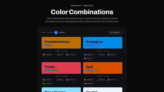
Color Combinations
Color combinations that match one color: a set per harmony rule and a neutral one, shown as text on a background with its WCAG contrast. Free, in the browser.
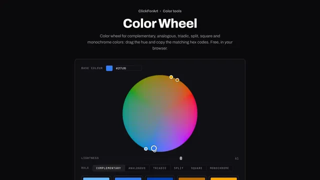
Color Wheel
Color wheel for complementary, analogous, triadic, split, square and monochrome colors: drag the hue and copy the matching hex codes. Free, in your browser.