Color Combinations
Color combinations that match one color: a set per harmony rule and a neutral one, shown as text on a background with its WCAG contrast. Free, in the browser.
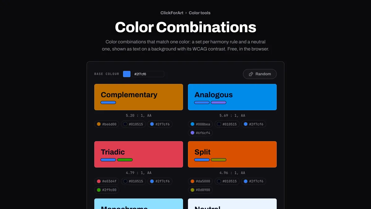
What colors go together?
Colors that work together usually have a clear relationship on the color wheel. They sit opposite each other, side by side, or spaced evenly around it. Those relationships are the harmony rules, and this page builds one combination from each rule around whatever color you pick.
Context matters too, though. In Interaction of Color, published in 1963, Josef Albers used his students' exercises to show how much a color changes depending on what's around it.
How to find matching colors for one color
Set Base colour with the picker or a hex code, or press Random. Six combinations show up: Complementary, Analogous, Triadic, Split, Monochrome and Neutral. Each card fills its background with one color from the set, shows your color and any others in the set as accent bars, and writes its name in a text color mixed from yours.
Below each sample you'll find the WCAG contrast ratio of that text on that background and the grade it earns: AAA, AA, AA for large text, or too low for text. Clicking a hex code under a card copies it.
How is each combination built?
The rules come from the Color Palette Generator, worked out in OKLCH, and the hues keep your color's lightness. Complementary places your color on the hue opposite it. Analogous puts it on the hue 20 degrees to one side and uses the hue 20 degrees to the other side as a second accent. Triadic and Split use the first of their two other hues as the background, at 120 or 150 degrees, with the second as an accent. Monochrome sets your color on a tint of itself with a darker shade as the second accent, and Neutral puts it on a near-white.
For the text, each card uses one of two neutrals made from your color, so both carry a trace of its hue.
Reading the cards for a landing page, a bold banner and a dark theme
Landing page: the Neutral card is your safe starting point, with your color on a near-white and near-black text. From the default #2f7cf6 it sets #010515 on #eaf3ff at 18.15:1. That takes care of the page background and body text, and your color is left free for accents.
Bold banner: Complementary and Split put a strong opposite hue behind the text. For the default blue, those are the oranges #be6d00 and #da5000, with near-black text at 5.20:1 and 4.96:1 (both AA) and the blue showing up as an accent bar.
Dark theme: contrast is the same in both directions, so you can flip any card. Take the Monochrome card's near-black text, #010515, as the page, and its pale #8edfff background becomes the text, at the same 13.69:1.
Can you set text in one color of a combination on another?
Rarely, and almost never with a complementary pair. The harmony rules rotate the hue and keep your color's lightness, so every color in a set comes out about as light as the others. #2f7cf6 against its complement #be6d00 measures 1.01:1, and #e63946 against #00a3b9 gets 1.38:1, way under the 4.5:1 body text needs. That's the reason every card writes its words in a near-white or near-black made from your color.
With that neutral text, the cards hold up well. We generated all six for 48 base colors, 36 of them fully saturated hues 10 degrees apart like the ones Random picks, and 275 of the 288 cards reached 4.5:1. The remaining 13 got to 3:1, which is enough for headings. All of them were Analogous, Complementary, Split and Triadic cards with a mid-lightness background, where neither the near-white (mixed 90 percent of the way to white in Oklab) nor the near-black (mixed 80 percent of the way to black) gets far enough away from it.
On one of those cards, use the colors for headings only, or darken the background a step and test the new pair in Color Contrast Checker.
Why do some combinations look loud or cheap?
Put two strong colors side by side in equal amounts and they fight for attention. The cards get around that with proportion: one color fills the background, the rest are thin accent bars, and the text is neutral. Use that same split on a page, giving one color most of the area and saving its partner for a button or a rule.
If the pair still feels too loud, nudge each one a little toward the other in Color Mixer. Taken 10 percent of the way in Oklab, #2f7cf6 and #be6d00 turn into #467ee4 and #b3723c. Their chroma drops from 0.198 to 0.166 and from 0.141 to 0.108, and neither hue moves more than 4 degrees.