Color Contrast Checker
Color contrast checker for text and background: the WCAG contrast ratio, pass or fail for AA and AAA at body and large text sizes, and a live text sample.
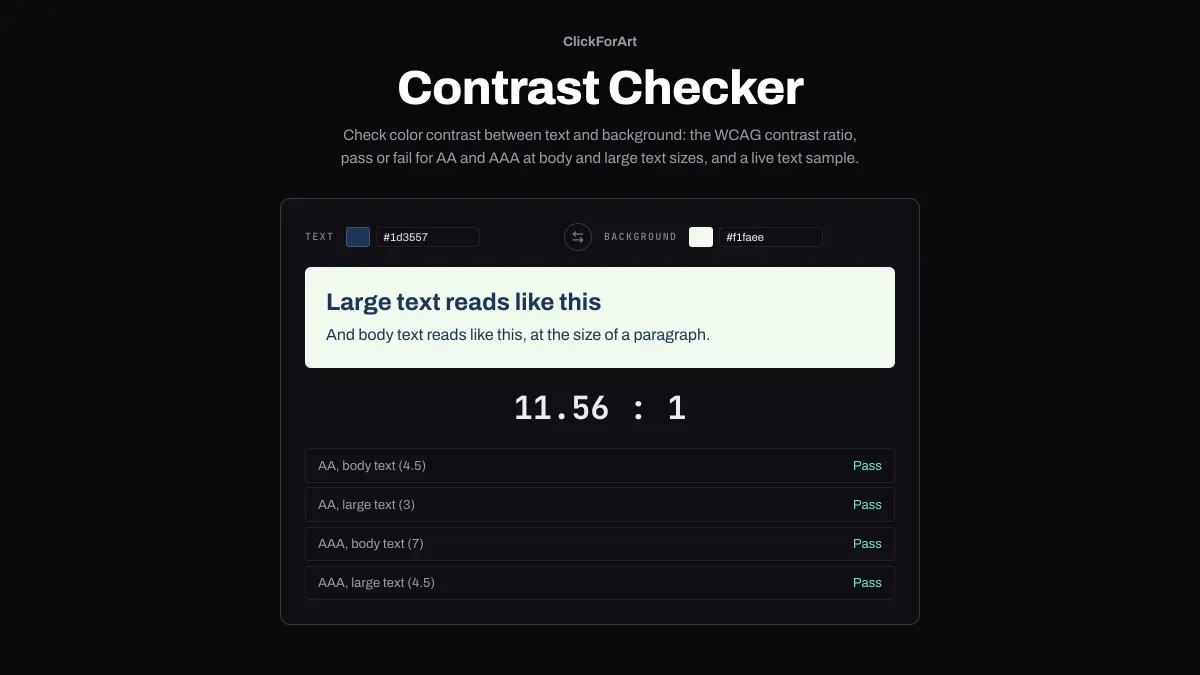
What is the WCAG contrast ratio?
WCAG, the Web Content Accessibility Guidelines, is the W3C's standard for accessible web content, and WCAG 2.2 is the current version. Its contrast ratio compares the relative luminance of two colors using (L1 + 0.05) / (L2 + 0.05), with L1 being the lighter of the two.
Relative luminance weights the linear sRGB channels at 0.2126 for red, 0.7152 for green and 0.0722 for blue, since the eye is most sensitive to green. The ratio goes from 1:1, which is the same color twice, up to 21:1 for black on white.
What contrast ratio passes WCAG AA and AAA?
Success criterion 1.4.3, Contrast (Minimum), is level AA. It asks for at least 4.5:1 for body text and 3:1 for large text. Success criterion 1.4.6, Contrast (Enhanced), is level AAA, at 7:1 for body text and 4.5:1 for large text.
Large text means at least 18 point (24 CSS pixels), or 14 point bold, which is about 18.7 pixels. WCAG doesn't round, so 4.499:1 fails the 4.5:1 threshold. This checker grades the exact ratio, not the two-decimal number it displays.
How to check color contrast
Set the Text color and the Background color with the picker or by typing a hex code. The arrows between them swap the two. Underneath, a sample shows a large heading and a line of body text in those colors.
You'll see the ratio to two decimal places, along with Pass or Fail for AA body text, AA large text, AAA body text and AAA large text. It updates as soon as you change either color.
Should text on a colored background be black or white?
Test both and go with the higher one, because one of them always passes. Under the WCAG formula, white and black text tie at a relative luminance of 0.179. Below that, white gives more contrast; above it, black does. Even right at the tie each one hits 4.58:1, so on any solid background at least one of the two clears the 4.5:1 AA requires for body text.
The tipping point is a mid gray. #767676 gets white at 4.54:1 and black at 4.62:1, and it also happens to be the lightest even gray that passes as text on white. Go one step lighter to #777777 and you get 4.48:1, a fail. Plenty of saturated colors land on black's side. Blue #2f7cf6 takes black at 5.33:1 versus white's 3.94:1, a pink #e91e63 gets 4.83:1 versus 4.35:1, and orange #ff8000 gets 8.34:1 versus 2.52:1.
In 2019 Andrew Somers, who later developed the APCA contrast method, opened a W3C issue arguing the formula doesn't match how people actually perceive contrast on screens, and others in that thread answered that white on orange really is hard for some readers to read. WCAG 2.2 is the current W3C Recommendation and the one this checker grades against. So if a brand needs white labels, darken the color until white passes, as the fixes below do.
Do icons, borders and input fields need contrast too?
They do, at 3:1. Success criterion 1.4.11, Non-text Contrast, asks for that much against neighboring colors for any part of a control or graphic you need to see in order to use it. That covers a text field's border when nothing else marks where the field is, a checkbox, a dropdown arrow, an icon that carries meaning, and the focus indicator. A button with a label that identifies it doesn't need a visible edge, and disabled controls are exempt.
To test one, put the border or icon color in Text and the color beside it in Background, then read the AA large text line, which uses the same 3:1. A #cccccc border on a white field comes out at 1.61:1. The lightest gray that clears 3:1 on white is #949494, at 3.03:1, and that works for large text as well. #959595 displays as 3.00 here, but it's really 2.995 and fails, because the threshold isn't rounded. A #2f7cf6 focus ring gets 3.94:1 on white.
Fixes for a brand blue, a button label and dark-mode text
Brand blue as link text: #2f7cf6 on white comes to 3.94:1. That's fine for a large heading but short of AA for body text. Mix it 10 percent toward black in Oklab using Color Mixer and it turns into #276bd6, at 5.05:1, still recognizably the same brand.
White label on a blue button: on #2f7cf6, white also measures 3.94:1, since the ratio doesn't care which color sits in front. Button labels are rarely large text, so take the button down to #2463c6, 15 percent toward black, for 5.71:1.
Dark mode on #121212: body text in #e0e0e0 reaches 14.19:1, and secondary text in #a0a0a0 gets 7.16:1, so both are AAA. #6e6e6e drops to 3.67:1. That's enough for large text and for disabled controls (which WCAG exempts anyway), but not for body copy.
How do I check text with transparency?
The checker only takes solid colors, so first figure out the color the browser actually draws. It blends a semi-transparent color with whatever is behind it channel by channel. In Color Mixer, set Mix in to RGB, Colour A to the background, Colour B to the text color, and Ratio to the opacity. White at 70 percent on #121212 is 30 : 70, and that gives #b8b8b8.
Then check that solid color here: #b8b8b8 on #121212 comes to 9.44:1. Black text at 60 percent on white flattens to #666666, which is 5.74:1.