Color Palette Generator
Generate a color palette of five from one base color with analogous, complementary, triadic, split or monochrome rules, built in OKLCH so the steps look even.
What are color harmony rules?
A color harmony chooses colors based on where they sit on the color wheel compared with a base hue. Analogous colors are neighbors, which here means 20 and 40 degrees to either side. Complementary is the one straight across, 180 degrees away, and triadic spaces three hues 120 degrees apart.
Split-complementary uses the two hues beside the complement, at 150 and 210 degrees, so the contrast is softer than a straight complement gives you. Monochrome sticks to one hue and steps it lighter and darker.
Why does this palette generator use OKLCH?
In HSL, two colors with the same lightness number can look nothing alike. Pure yellow and pure blue both sit at 50 percent, and yet the yellow looks far brighter. Oklab, which Björn Ottosson published in 2020, is designed so equal steps look like equal changes. OKLCH is that same space written as lightness, chroma and hue.
This tool rotates the hue and shifts the lightness in OKLCH while keeping the base color's chroma, which makes the steps between the five colors look even. It also keeps lightness away from the extremes, so no step collapses into pure black or white.
How to generate a color scheme from one color
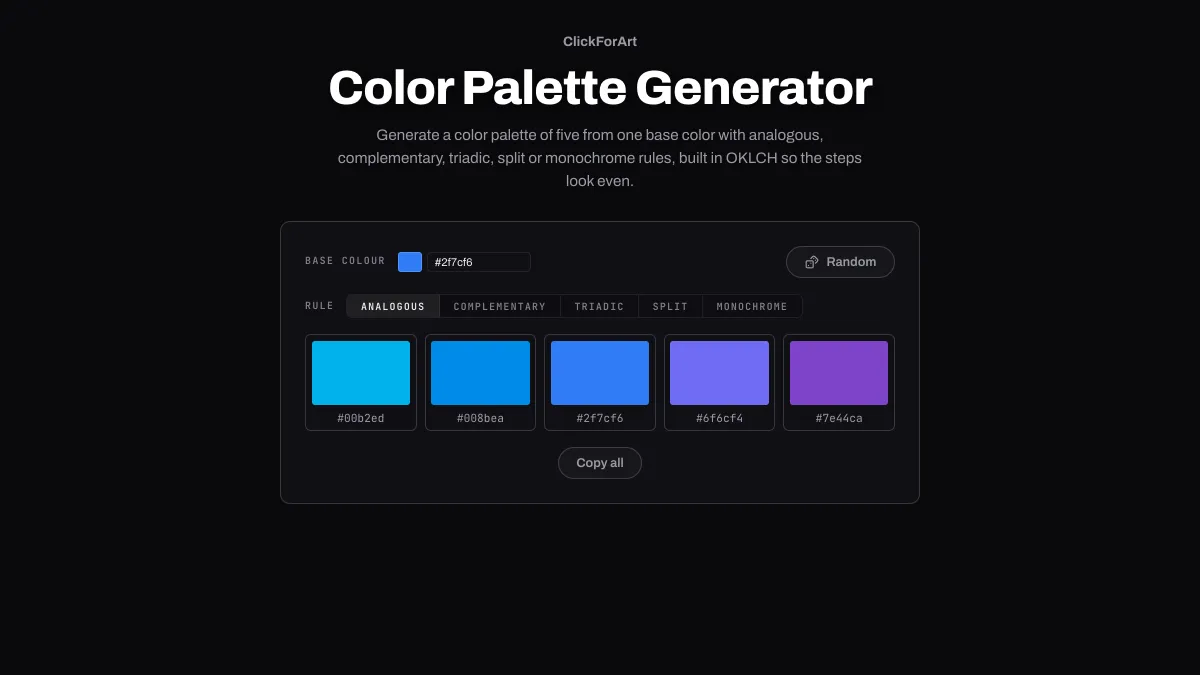
Set the Base colour with the picker, type in a hex code, or hit Random for a fresh hue. Then choose a Rule (Analogous, Complementary, Triadic, Split or Monochrome) and the five swatches update.
Every swatch shows its hex code, and clicking one copies it. Copy all puts all five codes on your clipboard as a single comma-separated line, ready to drop into a stylesheet or a design file. The plus button in any color picker saves a color in this browser, and from then on it's waiting for you in every picker on the site.
Settings for a UI color scale, a calm brand set and a button accent
UI color scale: Rule Monochrome steps the base 0.15 and 0.3 up and down in OKLCH lightness. Starting from the default #2f7cf6 you get #8edfff, #5fadff, #2f7cf6, #004cc2 and #001590. The fourth one is the color to use for links and text on white, at 7.47:1, while the base on its own only manages 3.94:1.
Calm brand set: Rule Analogous stays within 40 degrees on either side, so a blue base gives you two cyan-blues and two violets: #00b2ed, #008bea, #6f6cf4 and #7e44ca. Close neighbors almost never clash, and the darkest of the four passes AA as text on white at 5.89:1.
Button accent: Rule Complementary brings in the opposite hue, an orange #be6d00 for the default blue, plus a lighter #fba600. An accent that stands apart from the main color makes a button easy to spot. Check its label in Color Contrast Checker, though, since white on #be6d00 comes in under 4.5:1.
Why do some palette colors come out dull or olive?
Every color keeps the base's chroma, its colorfulness. The trouble is that sRGB can't show the same chroma at every hue and lightness. When a rotated hue falls outside what a screen can display, its channels get clipped back into range, and that dulls or shifts it. Yellows at mid lightness go olive, which is what happens to #8d8900 in the Split set of the default blue.
Start from a base with less chroma, or a lighter one, and the rotated hues will fit. Color Wheel draws that limit as the edge of its rim.