Frutiger Aero
Frutiger Aero is the glossy, bubbly look of mid-2000s tech: water, green fields, glass buttons and aurora wallpaper. Where the name came from and why it ended.
What is Frutiger Aero?
Frutiger Aero is the glossy, optimistic visual style of consumer technology from roughly 2005 to 2013: shiny glass buttons, water droplets and bubbles, aquariums, green fields under blue skies, aurora wallpapers and clean humanist sans-serif type. It's the look of Windows Vista and 7, early iPhone apps, MSN Messenger and countless phone ads from that time.
Nobody called it that back then. The name was coined years later, in 2017 by most accounts, by members of the Consumer Aesthetics Research Institute, an online group that catalogs the visual styles of consumer culture. It became widely known when the style turned into a nostalgia trend on TikTok in the early 2020s.
Where does the name come from?
Both halves are borrowed. Aero is Microsoft's name for the translucent glass interface of Windows Vista, released in 2007. Frutiger is the typeface Adrian Frutiger drew for the signs at Charles de Gaulle Airport near Paris, released as a font in 1976. Vista's Segoe UI and many tech brands of the era used type in the same open, friendly mold.
The pairing sums up the mood. Airport signage stands for clarity and travel, and the glass windows stand for a future that looks clean and transparent. Ads of the time showed technology sitting comfortably in nature, with laptops in meadows and phones splashed with water.
How do you recognize Frutiger Aero?
The palette is sky blue, aqua and grass green with lots of white. Surfaces are glossy, with a bright highlight across the top half of every button as if lit from above. There's real-world imagery everywhere, like bubbles, fish, leaves, dew and the bokeh of out-of-focus lights. Lens flares and soft glows sit on top. Windows XP's Bliss wallpaper, a photo of a green hill in California, is often counted as an early sign of the style.
Close cousins get confused with it. Y2K design around 2000 is more silver, chrome and techno. Fans have also split off narrower labels, such as Frutiger Eco for the nature-heavy, green side of the look.
Why did Frutiger Aero end?
Flat design replaced it almost overnight. Microsoft's Metro style went flat with Windows 8 in 2012, and Apple dropped its glossy, textured icons for iOS 7 in 2013. Flat shapes scaled better across the new range of screen sizes and densities and looked fresh against years of gloss.
Glassmorphism and Apple's 2025 Liquid Glass brought translucency back, but without the meadows and fish, which is why fans still treat Frutiger Aero as a closed era.
Making Frutiger Aero visuals
For an aero-style backdrop, start Mesh Gradient Generator on the Lagoon palette, which blends deep blue into aqua and pale cyan, or on Aurora for the northern-lights wallpaper look. Liquid Glass Effect then adds a glassy button or bubble on top: the Lens preset makes a thick disc, and a higher Sheen gives the bright rim. Finish with Bloom Effect on the Dreamy preset so the highlights glow.
Try it
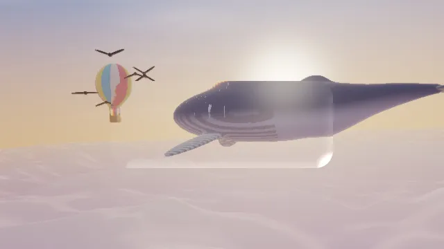
Liquid Glass Effect
Liquid glass effect: lay a lens of thick glass over a photo or video, as a rounded button, disc or pill that bends the picture at its edge and catches a sheen.
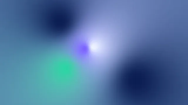
Mesh Gradient Generator
Mesh gradient generator: blend up to eight colors into a soft color gradient, mixed in OKLab so it stays clean. Free in your browser; save a PNG, MP4 or GIF.
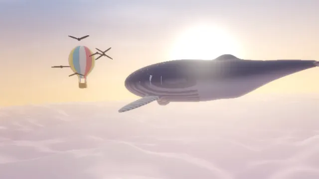
Bloom Effect
Halation and bloom effect for photos and video: bright parts spill soft light into their surroundings, as a red film glow or white haze. Free, in your browser.